Composition guide
AI Image Prompt Composition: Leave Room for Your Layout
Prompt Image Atlas editorial team · Published: 2026-09-20
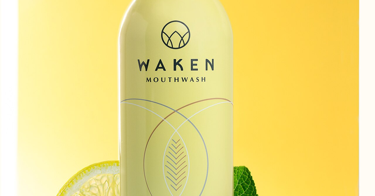
For useful AI image prompt composition, decide where the image will appear before describing its style. A website banner needs room for a headline, a product card needs a complete object, and a vertical cover needs space for both its subject and interface overlays. Specify the subject's position and the area that should stay quiet, then check the result inside the actual layout.
This guide provides three adaptable prompts and a crop exercise. The photograph and crops are illustrations made from an existing real photograph, not AI outputs or evidence that these prompts were tested. For the rest of your brief, use the basic image prompt structure.
Key takeaways
- Choose the destination ratio and text position first.
- Describe empty space by location and purpose, not just “minimal.”
- A crop removes content; it does not move subjects or create new background.
- Add final copy separately and inspect the finished layout at its displayed size.
1. Map the destination before writing the prompt
Start with a rough rectangle showing the subject, headline and any controls. You only need a sketch, the intended width and height, and a way to preview the exported image in its destination. Do not infer a platform's current requirements from the example dimensions below: they are working layout choices, not universal specifications.
For a 1200 × 630 banner, try placing the product on the right and the headline on the left. For a square product card, prioritize the complete silhouette. For a 9:16 cover, decide whether the headline belongs above or beside the subject. Leave room for actual interface elements shown by your publishing tool.
Write down the one detail that must survive a crop: a face, a mug handle, a bottle cap or a printed label. This gives you a concrete rejection rule. A composition can look attractive and still be unusable if that detail disappears.
2. Turn negative space into a specific instruction
Negative space is the relatively unoccupied area around a subject. It does not have to be white or completely blank; a quiet wall can work if its texture and light do not compete with the copy. “Minimal background” says little about where that usable space belongs.
Try “place the complete bottle in the right third; keep the left half a plain, softly lit background for a headline.” This names a subject, position, background and purpose. Treat these fractions as directions for the generator, not measured output coordinates. Check the resulting image yourself.
Keep the rest of the brief consistent. Asking for props scattered across the foreground while reserving the same foreground for copy creates a conflict. Choose one lighting direction and keep strong highlights away from the intended text area. If you need exact wording, add it in your layout editor after selecting the image.
3. Use a prompt matched to the format
These prompts are starting briefs, not model-specific syntax. Select a supported output shape in your image tool's controls; typing a ratio alone does not establish the exported dimensions.
A wide banner with copy on the left
Campaign image concept of one matte cream ceramic mug on a pale warm-gray surface. Wide composition, complete mug positioned in the right third, handle visible. Reserve the left half as a quiet continuous background for a headline added later. Soft light from the upper left, subtle contact shadow beneath the mug. No additional foreground props. Do not render headline text.
Place your real headline over the preview. If its longest line crosses the handle, the reserved space is not sufficient for that layout. Shorten the copy, adjust the layout or generate a composition with more separation. Use the product photography prompt templates to describe the object more precisely.
A square product card
Square catalog-style concept showing one matte cream ceramic mug, three-quarter front view with its handle visible on the right. Center the complete object with clear background around its rim, handle and base. Plain warm-gray surface and background, soft upper-left light, gentle contact shadow. Show only the mug. Keep decorative text out of the image.
Preview the card at its real thumbnail size. Check whether the product is recognizable and whether a badge, price or card corner obscures an edge. Large margins are not automatically better: too much space can make the object too small to inspect.
A vertical cover with copy above
Vertical editorial cover concept featuring one matte cream ceramic mug on a simple warm-gray surface. Place the complete mug in the lower-middle part of the frame with visible space on both sides of the handle. Keep the upper part a quiet continuous background for a short title added later. Soft directional light, restrained shadow, no extra props and no rendered lettering.
Check the destination's live preview with its actual title and controls. This prompt requests space but cannot ensure that a publishing interface will leave it visible.
4. Understand what the crop actually removes
All three panels below use the same 1200 × 630 source photograph with centered cropping. They show geometry, not a successful generated campaign. The square and vertical versions deliberately reveal why one landscape image may fail in another format.
When height stays at 630 pixels, a square crop has a width of 630 pixels. A 9:16 crop has a width of 630 × 9 ÷ 16 = 354.375 pixels before rounding. Moving the crop window sideways can preserve a different part of the scene, but cannot preserve everything outside that narrower window.
The previews use CSS object-fit: cover and centered positioning. As MDN explains, cover preserves the image's aspect ratio while filling its box; content can be clipped. Changing the focal position changes what gets clipped, not the amount of scene that exists.
5. Review the layout, then revise one constraint
Put the actual copy, button and badge on the image. Inspect both the full composition and the smallest displayed version. Look for cropped edges, background details behind letters, shadows that make text hard to distinguish, and product inaccuracies. A quiet area is not automatically readable with every text color.
If the headline overlaps the product, revise the subject placement or text area first. If a vertical crop loses the subject, make a separate vertical composition instead of demanding that the landscape crop do everything. If extra objects appear, simplify the brief before adding a long list of exclusions; supported negative-prompt controls vary by tool.
Save the prompt, generator, model, output dimensions and chosen crop together. You then have a repeatable brief and a visible acceptance test: the important detail survives, the text fits and the composition works in its destination. Explore the prompt gallery for a starting scene, then adapt its layout to one specific use.
Photo credit
The hero and crop exercise reuse “Waken Mouthwash – Still Life Photography” by Urbanphhotolab, licensed under CC BY-SA 4.0. The source was cropped to 1200 × 630; displayed square and vertical crops are further adaptations under the same license. The mug prompts are independent examples and did not produce this photograph.
